
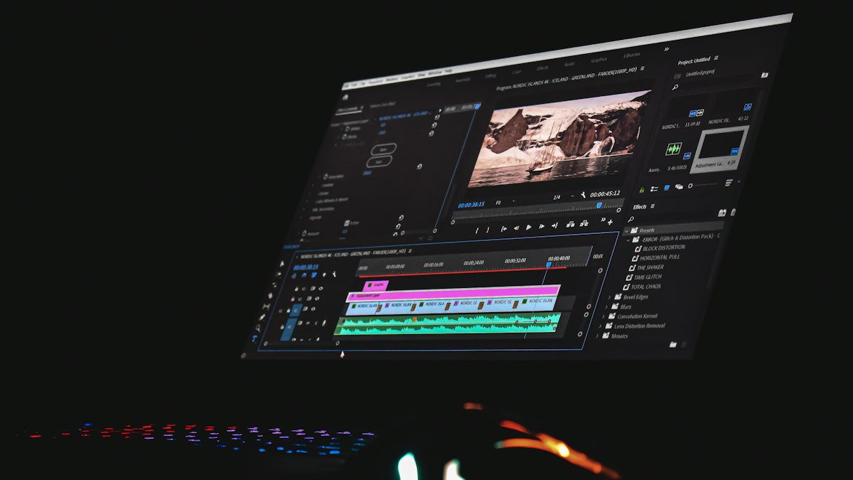
Large images are the most common reason web pages load slowly. Choosing the right format, resizing to the size actually displayed and compressing sensibly can cut file sizes dramatically.
Images often make up most of the data on a web page. A photo straight from a phone camera can be several megabytes, far larger than needed for a blog post or product page. Optimising images is one of the quickest ways to make a site faster, which improves the experience for visitors on slow connections and helps with Core Web Vitals.
Step 1: Choose the right format
| Format | Best for | Notes |
|---|---|---|
| JPEG | Photographs | Universally supported, lossy compression |
| PNG | Screenshots, graphics with text, transparency | Lossless; large for photos |
| WebP | Photos and graphics | Usually smaller than JPEG and PNG at similar quality; supported by modern browsers |
| AVIF | Photos | Often smaller still; supported by current major browsers, slower to encode |
| SVG | Logos, icons, simple illustrations | Vector, scales perfectly; only upload SVGs from trusted sources |
Step 2: Resize to the size you actually display
If your blog's content area is 800 pixels wide, uploading a 4,000-pixel-wide photo wastes bandwidth. Resize images to roughly the largest size they will appear, allowing extra for high-density screens. A common approach is about twice the displayed width for sharpness on high-resolution displays; for an 800-pixel area, 1,600 pixels is plenty.
Step 3: Compress
For lossy formats, a quality setting somewhere around 70 to 85 usually looks virtually identical to the original at a fraction of the size. Compare the result side by side at the size it will appear, and lower quality until you notice a difference, then step back up.
Free tools that work well:
- Squoosh: a browser-based tool from the Chrome team that lets you compare formats and quality visually.
- Built-in export options in image editors, including "Export for web" or "Save for web" features.
- Plugins or build tools that optimise images automatically when you upload them to your CMS.
Step 4: Serve responsive images
Responsive images let the browser download a smaller file on a phone and a larger one on a desktop. In HTML, the srcset and sizes attributes list several versions of an image. Many content management systems generate these automatically. The Learn Images course on web.dev covers responsive images and modern formats in depth.
Step 5: Lazy-load below the fold
Adding loading="lazy" to images further down the page tells the browser not to download them until the visitor scrolls near them. Do not lazy-load the main image at the top of the page; it should load as quickly as possible.
Step 6: Set width and height
Include width and height attributes (or CSS aspect ratios) on images so the browser reserves space before they load. This prevents content jumping around, which counts against the Cumulative Layout Shift metric.
Do not forget accessibility and SEO
- Use descriptive file names, such as red-trail-running-shoes.jpg rather than IMG_4821.jpg.
- Write meaningful alt text; see how to write alt text.
- Only use images you have the right to use, and credit photographers where the licence asks.
Check the result
Test a page with PageSpeed Insights before and after optimising. Look for warnings such as "Properly size images" and "Serve images in next-gen formats". A printable image optimisation checklist is available in our submissions library.











0 Comments
No comments yet — be the first to share what you think.